
The world of design and printing relies heavily on color accuracy and consistency. Whether you’re a graphic designer, printer, or just someone interested in the art of visual communication, understanding color and how to reproduce it accurately is crucial. One essential tool in this pursuit of precision is the Pantone Color and Pantone Matching System (PMS).
In this comprehensive guide, we will explore what Pantone colors are, delve into the Pantone Matching System, and learn how to find and use PMS colors in Adobe Illustrator. By the end of this article, you’ll have a solid understanding of Pantone colors and be well-equipped to incorporate them into your design projects.
View More Articles:
What are Pantone Colors?
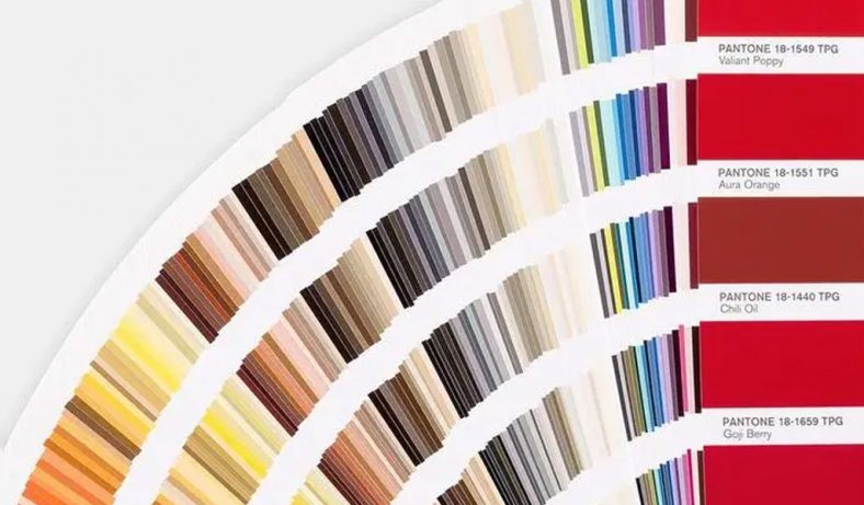
Pantone colors, often referred to as PMS colors, are a standardized system for identifying and matching colors.
Unlike the RGB (Red, Green, Blue) and CMYK (Cyan, Magenta, Yellow, Key/Black) color models, which are used primarily for digital displays and printing, Pantone colors provide a universal language for consistent color communication.
Pantone, a company founded by Lawrence Herbert in the 1960s, introduced this system to solve the problem of color inconsistencies in the graphic design and printing industry. Instead of relying on vague color descriptions or the limitations of traditional color mixing, designers and printers could now refer to specific Pantone color codes to achieve precise color matching.
Pantone colors are identified by unique alphanumeric codes, such as “PMS 185 C” for a bright red shade. These codes make it easy to specify and reproduce colors accurately.
The Significance of Pantone Colors in Design
The importance of Pantone colors in design cannot be overstated. Designers use Pantone colors to ensure that their vision is accurately translated from the digital realm to the printed page. Whether it’s a corporate logo, a product label, or a brochure, Pantone colors play a vital role in maintaining brand identity and delivering a consistent visual experience.
Furthermore, Pantone colors are crucial in industries where color accuracy is paramount, such as packaging, fashion, and interior design. They serve as a common reference point, allowing manufacturers, designers, and clients to communicate color expectations effectively.
Pantone colors also enable designers to work across different media and materials while maintaining color consistency. Whether it’s a business card, a fabric swatch, or a website design, Pantone colors provide a reliable way to ensure that the chosen hues are faithfully reproduced.
Pantone Color Libraries
Pantone offers a vast library of colors, each identified by a unique alphanumeric code. These codes make it easy to specify and reproduce colors accurately. The two primary color libraries within the Pantone Matching System are the Pantone Solid Coated and Pantone Solid Uncoated libraries.
- Pantone Solid Coated Library: This library is designed for coated paper stock, which includes glossy and semi-glossy surfaces. Coated papers have a smoother finish that reflects light differently from uncoated papers. As a result, Pantone Solid Coated colors may appear more vibrant and glossy when printed on coated paper.
- Pantone Solid Uncoated Library: In contrast, the Pantone Solid Uncoated library is intended for uncoated paper stock, which has a more textured and absorbent surface. Uncoated papers tend to absorb ink, leading to a softer and more matte appearance. Therefore, Pantone Solid Uncoated colors are tailored for this type of paper.
In addition to these primary libraries, Pantone provides specialized libraries for metallic and pastel colors, as well as neon and fluorescent colors, each with its own set of codes and swatches. These specialized libraries cater to specific design needs and creative preferences, allowing designers to explore a wide range of color possibilities.Pantone color libraries empower designers with a comprehensive palette of colors and the confidence that their chosen hues can be faithfully reproduced, regardless of the printing method or medium. This reliability is what makes Pantone colors an indispensable tool in the world of design and printing.
History and Evolution of the PMS
The history of the Pantone Matching System (PMS) is a fascinating journey that began in the 1960s and has since become an integral part of the design and printing industry.
- Origins in Printing: The PMS was born out of a need for a standardized color system in the printing industry. Prior to its development, printers and designers faced significant challenges when it came to color consistency. Each printing press, ink manufacturer, and design studio had its own interpretation of colors, leading to frustrating discrepancies.
- Lawrence Herbert’s Innovation: The PMS owes its creation to Lawrence Herbert, a visionary chemist who joined Pantone in 1962. Herbert recognized that the lack of a common color language was hindering the industry’s progress. He saw an opportunity to transform the way colors were identified and matched.
- Expansion of the PMS: Herbert’s first act was to reorganize Pantone’s color inventory and assign unique codes to each color. The initial release of the Pantone Color Matching System included 10 basic colors and a thousand standardized color formulations. Over time, this system expanded exponentially, growing to include thousands of colors.
- Standardization: The PMS introduced a level of standardization that revolutionized the industry. Designers, printers, and manufacturers could now refer to Pantone color codes to accurately specify and reproduce colors, eliminating the inconsistencies that plagued the field for decades.
How the Pantone Matching System Works
The Pantone Matching System operates on a simple yet highly effective principle: assigning a unique alphanumeric code to each color. This code consists of three parts:
- PMS Prefix: The prefix “PMS” stands for Pantone Matching System and is followed by a space.
- Color Number: This is a unique numeric identifier that corresponds to a specific color within the Pantone library.
- Suffix: The suffix indicates the color’s finish or paper type. For example, “C” stands for “Coated” and “U” stands for “Uncoated.” These suffixes specify whether the color is intended for use on coated or uncoated paper stock.
For example, “PMS 185 C” represents a bright red color intended for coated paper.
The Pantone Matching System is accompanied by physical color guides that display swatches of all available colors. These guides allow designers and printers to visually assess and select the desired colors. The Pantone color guides are periodically updated to reflect changes and additions to the color library, ensuring accuracy and relevance.
Advantages of Using PMS Colors
The Pantone Matching System offers numerous advantages in the world of design, printing, and beyond:
- 1. Color Consistency: PMS colors guarantee consistent color reproduction across various materials and printing techniques. Whether you’re printing business cards or designing product packaging, using PMS colors ensures that the final output closely matches your vision.
- 2. Brand Identity: Companies can establish and maintain their brand’s color identity through the use of PMS colors. This consistency is crucial for brand recognition and cohesion across marketing materials, products, and digital assets.
- 3. Precision: PMS colors allow for precise color matching. Designers can achieve the exact color they envision without the guesswork associated with other color models like RGB or CMYK.
- 4. Versatility: While originally developed for the printing industry, PMS colors have found applications in various fields beyond design. They are used in fashion, interior design, product manufacturing, and even digital media to ensure color consistency across platforms and materials.
- 5. Quality Control: PMS colors facilitate quality control by providing a reliable reference point for color evaluation. This helps identify any discrepancies in color reproduction early in the production process, reducing errors and waste.
- 6. Expanded Color Options: With thousands of colors in the Pantone library, designers have an extensive palette to choose from. This vast array of colors allows for creativity and customization in design projects.
- 7. Ease of Communication: PMS codes provide a universal language for color communication. Designers, printers, and manufacturers can easily understand and implement color choices, regardless of their location or expertise.
The Pantone Matching System has not only revolutionized the design and printing industry but has also become an indispensable tool for maintaining color consistency and precision across various sectors. Its history, principles, and advantages make it a cornerstone of color management in the modern world of visual communication and production.
Finding PMS Colors in Adobe Illustrator
Introduction to Adobe Illustrator
Adobe Illustrator is a powerful vector graphics editor that is widely used by graphic designers, illustrators, and artists to create vector-based artwork. It’s an essential tool for creating everything from logos and icons to complex illustrations and print materials. One of Illustrator’s key features is its ability to work seamlessly with Pantone colors, allowing designers to maintain color accuracy and consistency in their projects.Here’s a brief overview of some key features of Adobe Illustrator:
- Vector Graphics: Illustrator works with vector graphics, which are resolution-independent and can be scaled without loss of quality. This makes it ideal for creating logos and illustrations that need to be used at various sizes.
- Artboards: Illustrator allows you to work on multiple artboards within a single document, making it easy to create multiple designs or variations in a single file.
- Tools and Brushes: Illustrator provides a wide range of drawing and editing tools, as well as brushes and effects to enhance your artwork.
- Text and Typography: You can create and format text in Illustrator, making it suitable for designing everything from simple labels to complex layouts.
- Integration: Illustrator is part of Adobe’s Creative Cloud suite, which means it integrates seamlessly with other Adobe software like Photoshop and InDesign.
Adding Pantone Color Libraries to Illustrator
To work with Pantone colors in Adobe Illustrator, you need to add Pantone color libraries to your software. Here’s how to do it:
- Launch Illustrator: Open Adobe Illustrator on your computer.
- Create a New Document or Open an Existing One: You can start a new project or open an existing one; either way, you’ll be able to add Pantone colors to your document.
- Access Swatches Panel: Go to the “Window” menu and select “Swatches.” This will open the Swatches panel, which is where you’ll manage your colors.
- Load Pantone Color Libraries: In the Swatches panel, click on the menu icon (represented by horizontal lines) in the upper-right corner. From the dropdown menu, choose “Open Swatch Library” and then select “Color Books.” Here, you’ll find various Pantone color libraries, including Pantone Solid Coated and Pantone Solid Uncoated.
- Select the Pantone Library You Need: Depending on your project and the paper type you’ll be using, choose either Pantone Solid Coated or Pantone Solid Uncoated.
- Use Pantone Colors: The selected Pantone library will now appear as a separate swatch folder in your Swatches panel. You can click on any Pantone color swatch to add it to your document’s swatches.
Creating and Editing PMS Swatches
Once you’ve added Pantone color libraries to Illustrator, you can create and edit PMS swatches for your project:
- Select the Swatch Panel: Ensure that the Swatches panel is open (as mentioned in the previous section).
- Create a New Swatch: To create a new Pantone swatch, click on the “New Swatch” button in the Swatches panel. This will open a dialog box where you can specify the swatch name, color type (Pantone), and Pantone color code (e.g., “PMS 185 C”). You can also adjust other settings like color mode and tint if needed.
- Edit Existing Swatches: To edit an existing Pantone swatch, double-click on it in the Swatches panel. This will open the Swatch Options dialog, where you can modify the color, name, and other attributes.
- Organize Swatches: You can organize your Pantone swatches by creating folders or groups in the Swatches panel. This can help you keep your colors organized, especially in complex projects with many swatches.
Applying PMS Colors to Your Design
Once you have Pantone swatches in your document, applying them to your design elements is straightforward:
- Select the Design Element: Use the Selection tool (the black arrow) to select the design element to which you want to apply a Pantone color.
- Apply the Pantone Swatch: In the Swatches panel, simply click on the Pantone swatch you want to apply. The selected design element will instantly take on the chosen Pantone color.
- Edit Color Attributes: You can adjust the color attributes of a design element, such as its fill or stroke color, by selecting the element and then double-clicking the Pantone swatch in the Swatches panel. This allows you to fine-tune the appearance of your design.
Converting PMS Colors to CMYK or RGB
While Pantone colors are essential for ensuring color accuracy in print projects, you may also need to convert them to CMYK or RGB if you intend to use your designs for digital or online purposes. Here’s how to do it in Adobe Illustrator:
Converting to CMYK:
- Select the design element with the Pantone color you want to convert.
- Open the “Edit” menu and choose “Edit Colors,” then select “Convert to CMYK.” Illustrator will convert the Pantone color to its closest CMYK equivalent.
Converting to RGB:Follow the same steps as above but choose “Convert to RGB” instead of “Convert to CMYK.” Illustrator will convert the Pantone color to its closest RGB equivalent.
It’s important to note that while these conversions can get you close to the desired color, there may still be some variations, especially if the Pantone color has no direct equivalent in CMYK or RGB. In such cases, you may need to adjust the converted color manually to achieve the desired result.
Adobe Illustrator provides designers with a powerful platform for working with Pantone colors, allowing for precise color management and consistency across various design projects. By adding Pantone color libraries, creating and editing swatches, and converting colors as needed, designers can leverage the full potential of Pantone colors in both print and digital design.
Pantone Color Trends
Pantone Color of the Year
One of the most anticipated annual events in the world of color is the announcement of the Pantone Color of the Year. This color selection is a reflection of current cultural, social, and design trends and often serves as a significant influence in various industries. Here’s a closer look at the Pantone Color of the Year:
What is the Pantone Color of the Year?
The Pantone Color of the Year is a symbolic color selection that aims to capture the spirit, mood, and trends of the moment. It is chosen through a meticulous process by the Pantone Color Institute, a division of Pantone, Inc. This selection is intended to inspire and guide designers, artists, and creators across different fields.
The Impact of the Pantone Color of the Year:
The Pantone Color of the Year has a profound impact on various industries, including fashion, interior design, product design, graphic design, and more. Here’s how it influences these sectors:
- Fashion: Designers incorporate the Color of the Year into their collections, influencing clothing, accessories, and even makeup trends. It becomes a dominant color on runways and in retail stores.
- Interior Design: The chosen color often finds its way into home decor trends, influencing choices in paint, furniture, textiles, and decor accessories.
- Graphic Design: Graphic designers incorporate the Color of the Year into branding, packaging, and marketing materials for a fresh and contemporary look.
- Product Design: Manufacturers of consumer products, from electronics to kitchenware, take cues from the Color of the Year to create appealing and on-trend products.
- Advertising and Marketing: Advertisers and marketers use the Color of the Year to evoke specific emotions and capture the attention of consumers.
Examples of Past Colors of the Year:
- In 2021, Pantone chose “Ultimate Gray” and “Illuminating Yellow” as the Colors of the Year, reflecting resilience and hope in a challenging year.
- In 2020, “Classic Blue” was chosen for its calming and timeless qualities, providing a sense of stability amidst uncertainty.
- In 2019, “Living Coral” was selected for its vibrant and energizing characteristics, symbolizing optimism and connection.
The Pantone Color of the Year not only reflects current trends but also has the power to shape and influence design decisions, consumer choices, and the overall visual landscape for the year ahead.
The Influence of Pantone Colors in Fashion and Design
Pantone colors have a significant influence on both the fashion and design industries. Here’s a closer look at how these colors shape trends and aesthetics:
In Fashion:
- Runway Trends: Fashion designers often incorporate Pantone colors into their collections, making them a focal point on the runway. The Color of the Year, in particular, sets the tone for seasonal fashion trends.
- Retail and Consumer Choices: The Color of the Year appears in clothing, accessories, and makeup products, influencing consumer choices and driving sales.
- Color Coordination: Pantone colors provide a foundation for color coordination, helping designers and consumers create harmonious and fashionable outfits.
In Design:
- Interior Design: Pantone colors influence interior design trends, guiding choices in wall paint, furniture, upholstery, and decor accessories. These colors can evoke specific moods and aesthetics in residential and commercial spaces.
- Graphic Design and Branding: Graphic designers use Pantone colors to create visually appealing designs that align with brand identities and evoke desired emotions. The Pantone Color Matching System ensures that colors remain consistent across various applications.
- Product Design: Manufacturers of consumer products incorporate Pantone colors to make their products visually appealing and on-trend. This is especially evident in industries like technology and home goods.
- Advertising and Marketing: Advertisers and marketers leverage Pantone colors to create eye-catching campaigns that resonate with consumers and convey specific messages.
Pantone’s influence extends beyond aesthetics; it also plays a role in how colors are perceived and used in different contexts. Designers and creatives value Pantone colors for their reliability and consistency, making them a go-to resource for achieving precise color outcomes.
How Pantone Predicts Color Trends
Predicting color trends is a complex and multi-faceted process that involves a combination of research, analysis, and cultural observation. Pantone, through its Pantone Color Institute, has developed a systematic approach to forecast color trends:
- 1. Global Trend Analysis: Pantone experts continually monitor and analyze color trends across various industries, including fashion, design, technology, and entertainment. They observe color usage in art, pop culture, and social media.
- 2. Consumer Preferences: Pantone conducts surveys and gathers feedback from consumers, designers, and other professionals to understand color preferences and emotional responses to colors.
- 3. Color Psychology: Pantone considers the psychological and emotional impact of colors. Certain colors can evoke specific feelings or moods, and these considerations play a role in trend predictions.
- 4. Sociocultural Influences: Pantone looks at broader sociocultural factors, such as political events, environmental concerns, and social movements, to gauge their potential impact on color choices.
- 5. Travel and Exploration: Pantone experts travel the world, seeking inspiration from different cultures, landscapes, and natural environments. These experiences often influence color choices.
- 6. Historical References: Pantone researchers study color history and trends, examining how colors have evolved over time and identifying recurring themes.
- 7. Collaborations: Pantone collaborates with designers, brands, and influencers to gain insights into emerging color trends and how colors are used in innovative ways.
- 8. Color Forecasting: Based on their research and observations, Pantone experts identify key colors that are likely to dominate in the coming year. The selection process involves careful consideration of color harmonies and the interplay of different hues.
The Pantone Color of the Year is the culmination of this extensive research and forecasting process. It is intended to capture the zeitgeist and provide a guiding color that resonates with the cultural and emotional climate of the moment. Pantone’s track record of accurately predicting color trends has made it a trusted resource for designers and industries worldwide, shaping the way we perceive and use color in our everyday lives.
Pantone Beyond Print: PMS in Other Industries
Pantone in the Fashion Industry
Pantone’s influence extends well beyond the realm of print and graphic design; it plays a pivotal role in the world of fashion as well. Here’s how Pantone colors are utilized in the fashion industry:
- 1. Trendsetting: Fashion designers and brands look to Pantone’s Color of the Year as a source of inspiration for their collections. This chosen color often becomes a dominant trend on runways and in retail, influencing clothing, accessories, and even makeup.
- 2. Color Consistency: Pantone colors provide a standardized reference for fashion designers. When they specify a particular Pantone shade for their designs, they ensure that the fabric, dye, and accessories are precisely matched to achieve color consistency.
- 3. Textile Production: Textile manufacturers use Pantone colors as a guide for dyeing fabrics and creating textiles. This ensures that fabrics are produced in the exact shades required by fashion designers.
- 4. Color Matching in Retail: In retail, Pantone colors help maintain consistency across products. From the color of a dress to the packaging, brands use Pantone references to ensure that their visual identity remains uniform.
- 5. Collaboration and Licensing: Pantone collaborates with fashion brands to produce limited-edition collections, offering consumers the opportunity to wear iconic Pantone colors.
In the fashion industry, Pantone colors are not merely about aesthetics; they represent a language of consistency and a tool for creativity and innovation. They help designers create cohesive collections, ensuring that the chosen colors are accurately reproduced in clothing and accessories.
Pantone in Interior Design
Interior design is another arena where Pantone colors hold significant sway:
- 1. Paint Selection: Pantone colors are used as a starting point for selecting paint colors for interior spaces. Designers and homeowners can easily find the closest paint matches to Pantone colors, ensuring that their walls, ceilings, and trim are in line with their design vision.
- 2. Furniture and Decor: Interior designers incorporate Pantone colors into furniture, upholstery, curtains, and decor accessories. These colors help create cohesive and visually appealing interior environments.
- 3. Color Coordination: Pantone colors serve as a guide for creating harmonious color schemes in interior design projects. Designers can use Pantone references to select complementary or contrasting colors for various elements within a space.
- 4. Customization: For clients seeking personalized interiors, Pantone colors offer a way to bring unique and meaningful colors into their living spaces.
- 5. Trend Integration: Just as in fashion, interior designers take cues from Pantone’s Color of the Year to create trendy and up-to-date designs that reflect the current cultural and design climate.
Pantone’s influence in interior design is a testament to the universality and adaptability of its color system. Whether it’s a modern apartment, a cozy living room, or a corporate office, Pantone colors help designers and homeowners create visually striking and harmonious interiors.
Pantone in Digital Media
In the digital age, Pantone colors have also found their place in the world of digital media and online design:
- 1. Web Design: Pantone colors are often used as references for web designers to ensure that the colors used in digital interfaces match those intended for print. This helps maintain brand consistency across different platforms.
- 2. Digital Art and Illustration: Digital artists and illustrators incorporate Pantone colors into their work when creating digital art for various applications, including social media graphics, digital marketing materials, and online publications.
- 3. Branding and Social Media: Social media branding and content creation often involve the use of Pantone colors to ensure that a brand’s visual identity remains consistent and recognizable online.
- 4. User Interface Design: App and software developers use Pantone colors to create appealing and user-friendly interfaces. Consistent color schemes can enhance the user experience.
- 5. Digital Printing: When digital printing is used for materials like banners, posters, and promotional materials, Pantone colors are essential for ensuring that the final output matches the intended design.
Pantone colors have seamlessly transitioned into the digital landscape, helping digital designers and developers maintain color accuracy and consistency in an increasingly digital and online world. Whether it’s on a website, in a social media post, or on a digital display, Pantone colors continue to play a vital role in visual communication and design.
Challenges and Limitations of Pantone Colors
Cost and Accessibility
While Pantone colors offer precise color matching and consistency, there are challenges and limitations associated with their cost and accessibility:
- Cost of Pantone Guides: Pantone color guides, which contain physical swatches of all Pantone colors, can be expensive. Designers and printers often need to purchase updated guides periodically to stay current with the latest colors, which adds to the overall cost.
- Licensing Fees: Some industries, such as fashion and product manufacturing, may require the use of Pantone colors. Licensing Pantone colors for these purposes can be costly for designers and brands.
- Accessibility for Small Businesses: Small businesses and independent designers may find it challenging to invest in Pantone color guides and licensing fees, limiting their ability to work with Pantone colors effectively.
- Limited Color Libraries: While Pantone offers an extensive range of colors, there may still be situations where a specific color cannot be accurately replicated using Pantone colors alone. This limitation can lead to additional costs when custom color mixing is required.
Color Reproduction Variability
Despite its precision, Pantone color reproduction may face variability due to several factors:
- Printer and Ink Variations: Different printers and types of ink can produce variations in Pantone color reproduction. Low-quality printers may struggle to achieve the exact color match, leading to inconsistencies in the final output.
- Paper Stock Differences: The choice of paper stock, whether coated or uncoated, can affect how Pantone colors appear when printed. Coated paper may result in a more vibrant and glossy finish, while uncoated paper may produce a softer, matte appearance.
- Environmental Factors: Environmental conditions, such as humidity and temperature, can impact the color output of printed materials. This variability can be especially challenging for large-scale printing operations where consistency is critical.
- Ink Aging: Over time, inks can change in color due to exposure to light, air, and other environmental factors. This aging process can lead to discrepancies in color reproduction if not carefully monitored.
While Pantone strives for accuracy, these factors highlight the importance of working closely with experienced printers and conducting color tests to ensure the desired color outcome.
Alternatives to Pantone
While Pantone is a widely recognized and trusted color matching system, there are alternative approaches and systems available:
- CMYK and RGB Color Models: For digital design and printing, the CMYK and RGB color models are commonly used. They are more cost-effective and accessible for many designers, especially those working on digital platforms.
- Color Management Systems (CMS): CMS software can help ensure consistent color reproduction across various devices and printers. These systems use ICC profiles and calibration to maintain accuracy.
- Brand-Specific Colors: Some companies create their own custom color libraries to maintain brand consistency. While this approach can be effective, it limits the ability to communicate color choices universally.
- Open Color Systems: Some open-source color systems are free to use and provide a broad range of colors. These systems may not offer the same precision as Pantone but can be suitable for less demanding projects.
- NCS (Natural Color System): NCS is another color system that aims to provide an international standard for color communication. It is particularly popular in Europe.
Designers and brands should carefully evaluate their specific needs and budget constraints when choosing between Pantone and alternative color systems. The choice often depends on the nature of the project, the industry, and the desired level of color accuracy and consistency.
Tips and Best Practices for Working with Pantone Colors
Maintaining Color Consistency
Maintaining color consistency when working with Pantone colors is essential to achieving the desired results in your design projects. Here are some tips and best practices:
- 1. Use Pantone Swatches: Always use Pantone swatches from official Pantone color guides or libraries within design software to specify colors. Avoid relying solely on screen previews, as they may not accurately represent the final printed color.
- 2. Communicate Color Choices: Clearly communicate your chosen Pantone colors to all stakeholders, including clients, printers, and manufacturers. Provide them with the Pantone color codes to ensure everyone is on the same page.
- 3. Color Tests and Proofs: Prior to final production, request color proofs or test prints from your printer. This allows you to verify that the chosen Pantone colors match your expectations.
- 4. Use the Right Color Mode: Ensure that your design software is set to the correct color mode (CMYK or RGB) for your project. Pantone colors are most effective in a CMYK workflow for print projects.
- 5. Consider Paper Stock: Be mindful of the paper stock you’ll be using, as it can affect how Pantone colors appear when printed. Coated and uncoated papers produce different results.
- 6. Monitor Environmental Conditions: Be aware of environmental factors that can affect color, such as humidity and temperature. Keep printing environments stable to reduce color variability.
- 7. Maintain Consistency Across Platforms: If your design will appear in both print and digital media, ensure that the Pantone colors are accurately translated to digital formats using color profiles and conversions.
Designing for Various Printing Methods
Pantone colors are versatile and can be used in various printing methods, but it’s essential to consider the specific requirements of each method. Here are tips for designing for different printing methods:
- 1. Offset Printing: Offset printing is a popular choice for high-quality, large-volume print jobs. When designing for offset printing, make sure your Pantone colors are correctly specified in CMYK mode, as most offset presses use this color model. Work closely with your printer to ensure accurate color reproduction.
- 2. Digital Printing: Digital printing is well-suited for short-run and on-demand printing. It can handle Pantone colors effectively. Ensure that your design software is set to the CMYK color mode for digital printing.
- 3. Screen Printing: Screen printing is commonly used for apparel and promotional products. Provide Pantone color codes to your screen printer to achieve precise color matches on fabric and other materials.
- 4. Large Format Printing: For large format printing, such as banners and signage, consider the viewing distance. Pantone colors may appear differently at a distance, so consult with your printer to select colors that maintain their impact from afar.
- 5. Flexography and Gravure: These printing methods are often used for packaging and labels. Work closely with your printer to ensure that the Pantone colors are accurately reproduced on various packaging materials.
Collaborating with Printers and Manufacturers
Effective collaboration with printers and manufacturers is crucial for successful Pantone color management. Here are some best practices:
- 1. Establish Clear Communication: From the outset, communicate your color requirements clearly with your printer or manufacturer. Provide Pantone color codes and specify the desired finish (coated or uncoated).
- 2. Request Color Proofs: Request color proofs or samples before production begins. This step allows you to assess the accuracy of Pantone color reproduction and make any necessary adjustments.
- 3. Consult with Experts: If you’re new to working with Pantone colors, seek advice from experienced printers or manufacturers. They can provide valuable insights into achieving the best results for your project.
- 4. Visit Printing Facilities: If possible, visit the printing or manufacturing facility to see the production process firsthand. This can help you better understand how Pantone colors are applied and ensure quality control.
- 5. Maintain Flexibility: While Pantone colors offer precision, there may be situations where minor adjustments are needed to achieve the desired visual outcome. Be open to collaboration and problem-solving with your printing or manufacturing partners.
- 6. Document Color Choices: Keep thorough records of the Pantone colors used in each project. This documentation is valuable for future reference and ensures consistency if additional print runs are required.
Working with Pantone colors is a collaborative effort between designers, printers, and manufacturers. Clear communication, attention to detail, and a willingness to adapt when necessary are key to achieving the best results in your design and production projects.
Conclusion: Pantone Colors in the World of Design
Recap of Key Points
In this comprehensive exploration of Pantone colors in the world of design, we’ve covered a wide range of topics and insights. Let’s recap some of the key points:
- What are Pantone Colors: Pantone colors are a standardized color matching system used in design, printing, and various industries to ensure consistent and precise color reproduction.
- Pantone Matching System (PMS): The Pantone Matching System is the foundation of Pantone colors, featuring a vast library of unique color codes and swatches.
- Significance of Pantone Colors: Pantone colors are significant in design due to their role in achieving color consistency, brand identity, and precise color matching.
- Pantone Color Trends: The annual Pantone Color of the Year influences fashion, design, and culture, reflecting current trends and emotions.
- Pantone Beyond Print: Pantone colors extend beyond print to industries like fashion, interior design, and digital media, influencing aesthetics and consistency in each.
- Challenges and Limitations: Pantone colors have challenges such as cost and color reproduction variability, leading to alternatives and considerations for color management.
- Best Practices: Working with Pantone colors requires maintaining color consistency, designing for various printing methods, and collaborating effectively with printers and manufacturers.
The Future of Pantone Colors
The future of Pantone colors is promising and likely to be influenced by several factors:
- Advancements in Technology: Continued advancements in color measurement and digital technology will likely enhance the accuracy and accessibility of Pantone colors.
- Sustainability: As sustainability becomes increasingly important, Pantone may focus on eco-friendly color choices and practices in response to industry and consumer demands.
- Globalization: Pantone’s influence will continue to spread globally, with more industries and regions adopting Pantone color standards.
- Diversity and Inclusivity: Pantone may place a greater emphasis on diversity and inclusivity in color choices to reflect the evolving cultural landscape.
- Interdisciplinary Integration: Pantone colors will continue to find applications in a wide range of fields, from design and fashion to product development and digital media.
Embracing the Art and Science of Color
The world of design is a beautiful blend of art and science, and Pantone colors exemplify this fusion. Designers harness the artistry of color theory and aesthetics while relying on the scientific precision of color matching systems like Pantone. As we move forward, it’s essential to continue embracing both aspects:
- Art of Color: Celebrate the creativity and emotional impact of color in design. Pantone colors offer a vast palette for artistic expression and evoke feelings, moods, and cultural connections.
- Science of Color: Appreciate the scientific rigor of color management. Pantone’s systematic approach ensures that colors remain consistent across different media and materials, fostering reliability and trust.
Pantone colors are more than a color matching system; they are a bridge between the art and science of color in the design world. By understanding their significance, embracing their versatility, and navigating their challenges, designers can continue to create visually stunning and precisely reproduced designs in a world filled with vibrant and meaningful colors.